
AFTER RESTYLING

the task
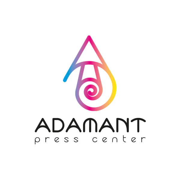
LOGO
Adamant is a printing house that produces printed advertising products, from business cards to large-format printing (banners, billboards).
The printing house is proud of the quality of its products. It was the concept of quality that was put into the first concept of the logo, which was depicted as a precious stone “adamant” viewed under a magnifying glass.
We were given the task to update the logo, making it more understandable, while keeping the main meaning – quality.
DESIGN CONCEPT
When creating the logo concept for Adamant, the capital letter “A”, the silhouette of an ink drop, the symbolic roll of print media, the golden ratio were compiled. In new logo a gradient of three colors was used: blue (Cyan), pink (Magenta) and yellow (Yellow). The name itself was written in black (Key color). Thus was used the classic subtractive color scheme, which is used primarily in printing for standard triad printing – CMYK.

updated
VISUALIZATIONS
Visual demonstrations of how a corporate identity may look on different media.