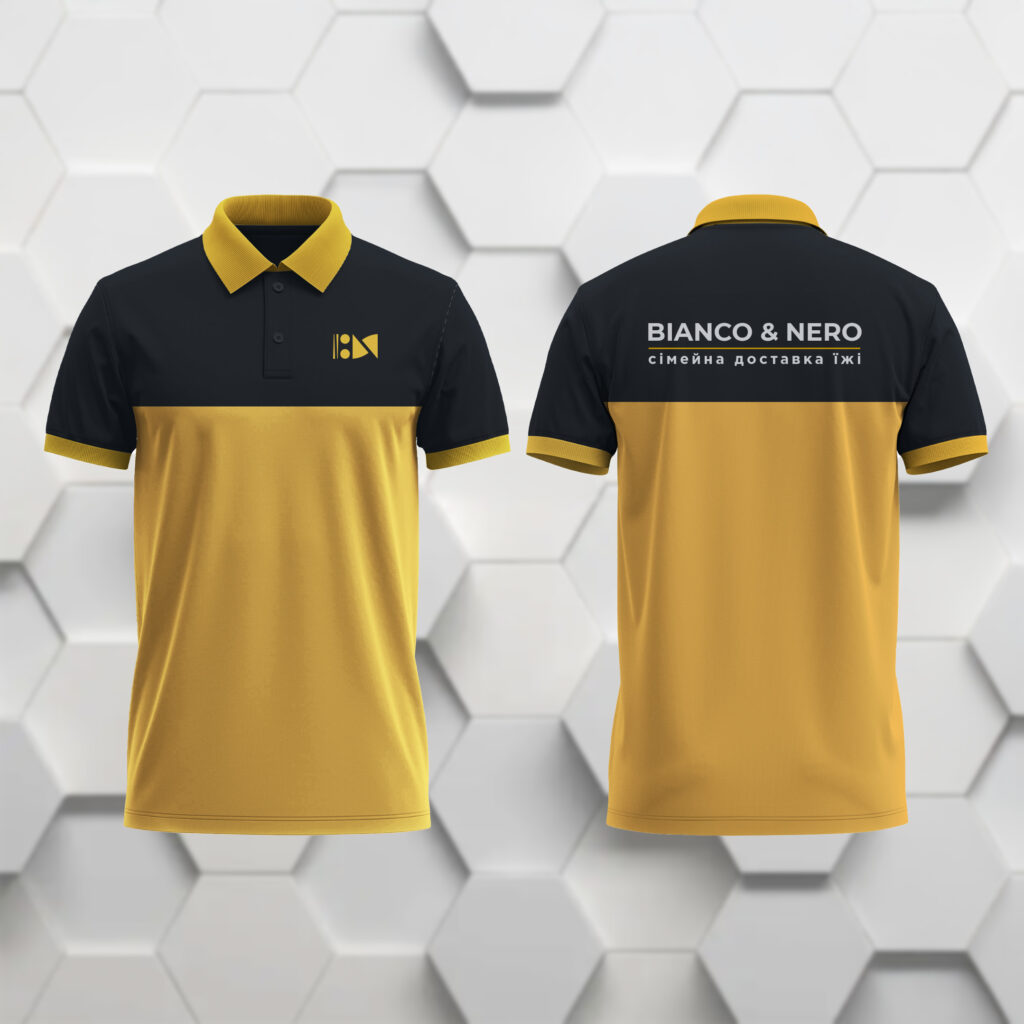
Bianco & Nero restyling 

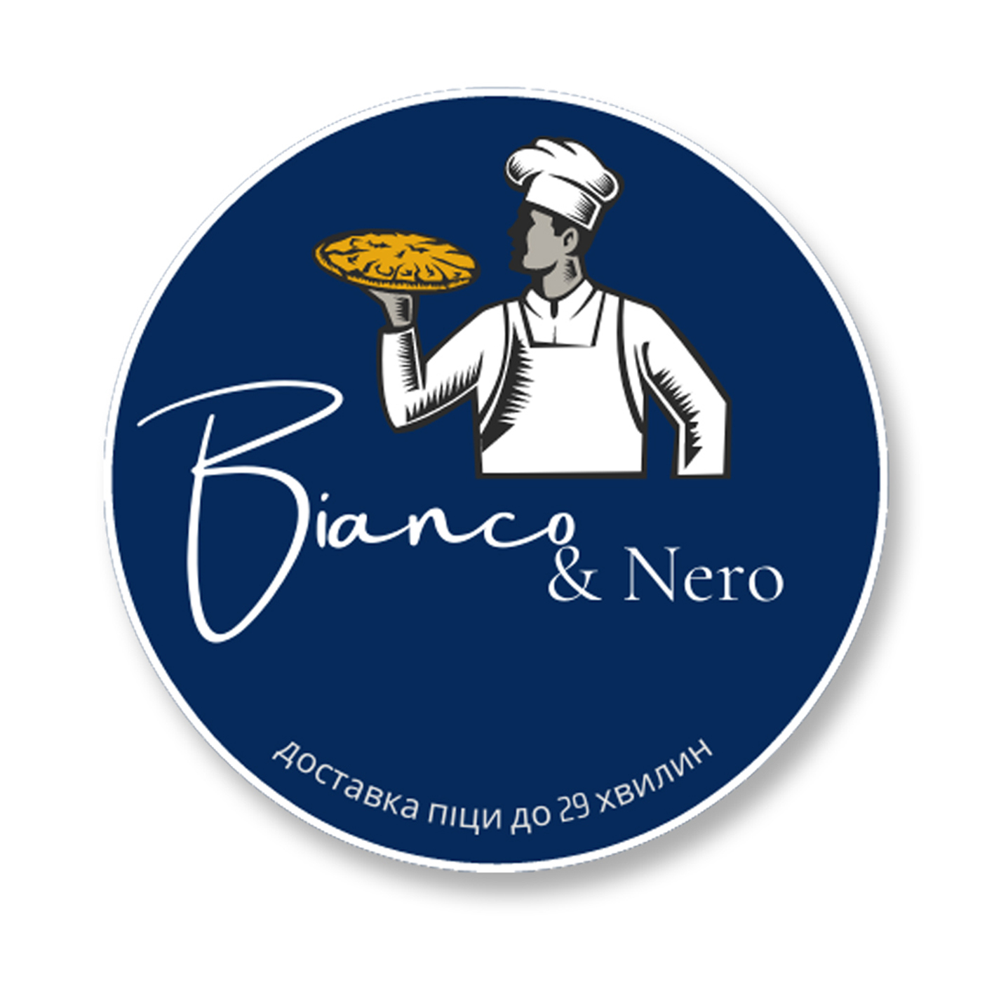
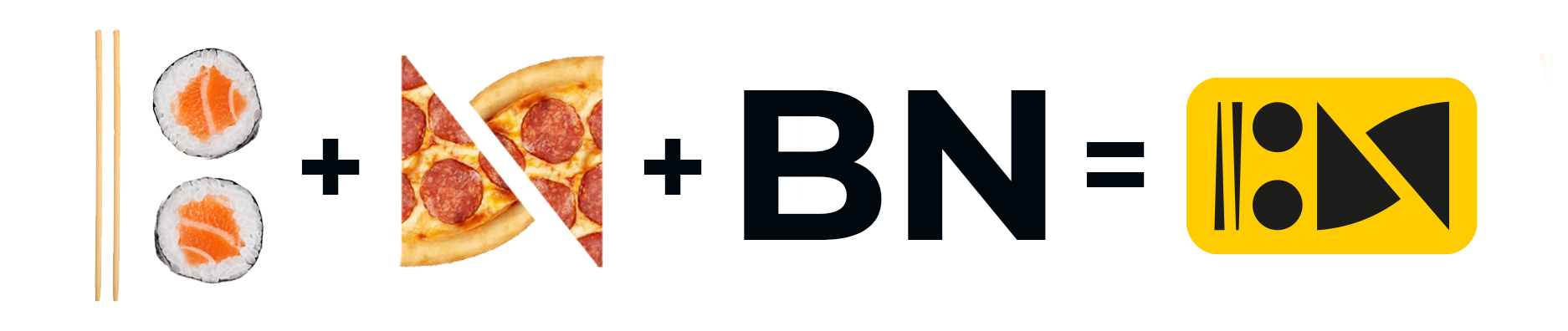
Ivano-Frankivsk food and delivery establishment “Bianco & Nero” opened as a pizzeria. But in 2024, the owners decided to expand the range of products. Sushi was added to the menu and therefore the old logo, containing only an image of a pizza, was no longer relevant.

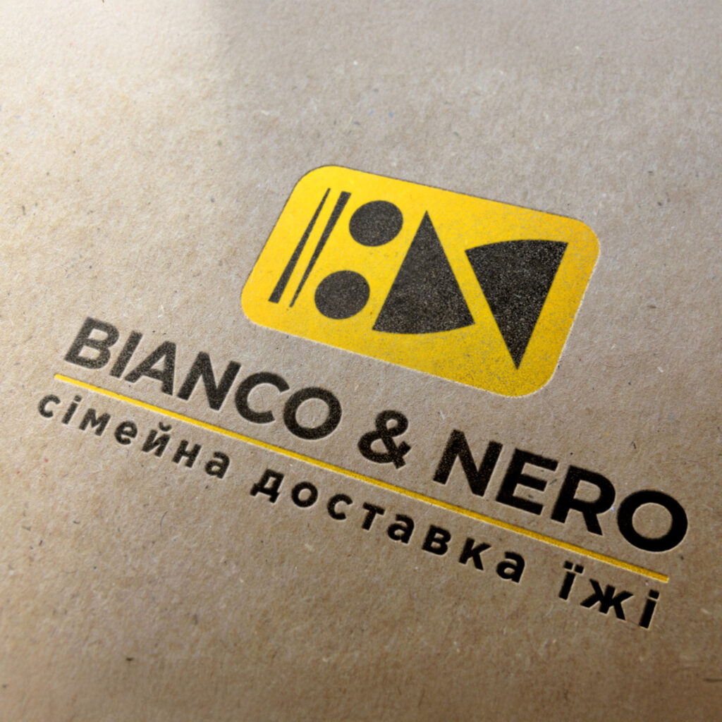
TASK: Creation of a new logo and a modern visual communication strategy for the company with existing and potential customers.

BEFORE RESTYLING

AFTER

DESIGN CONCEPT

When developing a new logo in the traditions of connotative design, it was decided to reproduce in a minimalist style both the denotative meanings of the establishment (sticks, sushi, and pizza slices) and the connotative ones. For this purpose, negative space was used around the contra figures, which created the silhouettes of the first letters “B” and “N” from the words Bianco & Nero. The interweaving of second-level associations strengthens the non-verbal communication of the brand with the consumer, adding specific weight to the brand.

VISUALIZATIONS

To demonstrate what the new identity will look like, we created visualizations of what the new logo will look like on clothing, signs, pens, and other advertising media.

If you need to develop a logonamingslogan, or corporate identity, contact us! We at PYROMIDA Agency have extensive experience in branding (creating corporate identity) in the following spheres: healthcare, oil refining, engineering, IT, FMCG products, metal rolling, construction, gardening equipment, education, clothing, music, etc.

Menu