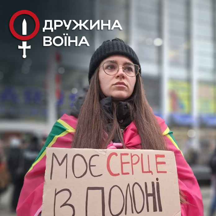
NGO Warrior’s Wife

NGO “Warrior’s Wife” was founded in 2018 to unite in a single community wives whose husbands are going or have already gone to the defense of Ukraine, or have returned and are struggling with manifestations of PTSD, were injured, missing, or killed.

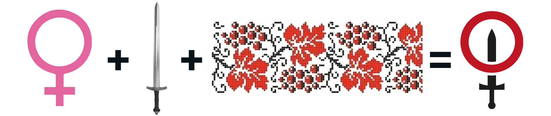
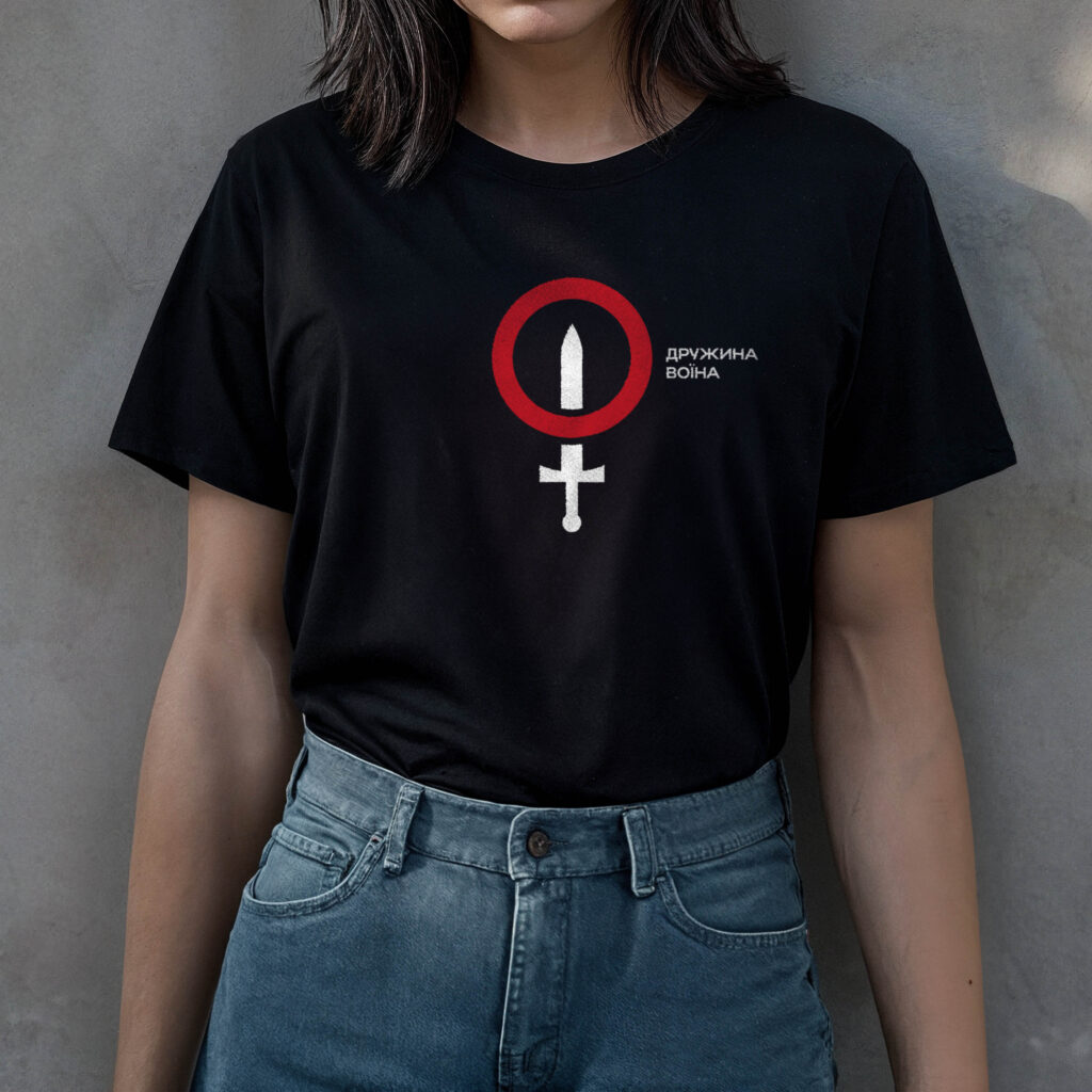
TASK: to create an updated, more expressive, and modern visual communication strategy for the company with women and companies providing financial support to the community organization.

BEFORE RESTYLING

AFTER

DESIGN CONCEPT

The concept is based on two symbols: the circle, symbolizing the unification of women, and the sword, symbolizing the warrior and war. Coming together, these two symbols form the “mirror of Venus” – a female symbol.

White, black and red were chosen as colors for branding because these colors have had a special symbolic meaning for Ukrainians since ancient times: white as a symbol of the divine and pure, peace; black as a symbol of chaos, destruction, dark forces; and red as a symbol of blood, fire and heat.

VISUALIZATIONS

To demonstrate what the new identity would look like, we created visualizations for the client of what the new logo would look like on apparel, signs, posters, and other advertising media.

If you need to develop a logonamingslogan, or corporate identity, contact us! We at PYROMIDA Agency have extensive experience in branding (creating corporate identity) in the following spheres: healthcare, oil refining, engineering, IT, FMCG products, metal rolling, construction, gardening equipment, education, clothing, music, etc.

Menu